Ihor Masalov

Latest update: April 23, 2025
Ensuring that your fonts gracefully scale across devices involves a blend of strategic planning and technical implementation. Here are the actionable steps to make your website’s text a paragon of readability:
Start with a sensible base font size (typically 16px), which will serve as your typographic foundation.
Shift towards relative units like percentages (%) or ems (em) for defining font sizes, ensuring a scalable and adaptable typographic hierarchy.
Media queries become your tool of choice to tailor font sizes to different screen widths, transforming the user experience from good to great.
Don’t skimp on line height; maintaining a line height of at least 1.2em is crucial for improving text readability across devices.
Let’s illustrate the dynamic scalability of font sizes with a practical example:
html {  font-size: 100%; /* Base font size */}
@media screen and (max-width: 768px) {  html {    font-size: 90%; /* Reduce font size on smaller devices */  }}
@media screen and (max-width: 480px) {  html {    font-size: 85%; /* Further reduce for very small devices */  }}
p { font-size: 1em; /* Default paragraph font size */ line-height: 1.4; /* Enhanced line height for readability */}In today’s digital landscape, where screen sizes range from compact smartphones to expansive desktop monitors, ensuring the text on your website is easily readable becomes a crucial aspect of design. The legibility of your website’s font can significantly impact user experience, potentially influencing both engagement and accessibility.
Consistent font legibility is crucial for delivering a positive user experience across all devices. From selecting the right theme to fine-tuning typography with CSS, the following strategies will help ensure your content remains clear, readable, and accessible to everyone.
Choosing a responsive theme is one of the easiest and most effective ways to ensure your text remains legible on all screen sizes. These themes automatically adjust font sizes and layouts based on the device, eliminating the need for manual tweaks. This is a foundational step in creating a mobile friendly website that delivers a seamless reading experience.
Top sources for modern, responsive themes include:
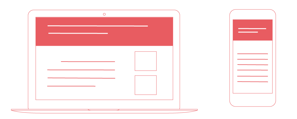
Responsive design, powered by CSS media queries, allows you to build a single version of your site that dynamically adapts its layout and typography to fit any screen. This involves setting base font sizes and using relative units like percentages or ems to allow text to scale fluidly across devices.
The CSS font-size property determines text size and can be defined using units like pixels (px), points (pt), or ems (em). According to Google’s best practices:
If responsive design isn’t feasible, an alternative is to create separate versions of your site for desktop and mobile users. This method gives you full control over font sizes, spacing, and layout for each platform, helping maintain readability and ensure your site remains a truly mobile friendly website.
To ensure your font sizes are effective on any device, consider the following best practices:
Media queries become your tool of choice to tailor font sizes to different screen widths, transforming the user experience from good to great. For further guidance on using media queries effectively, the Google Developers site offers a wealth of resources and examples.
Achieving universal readability is a balancing act between design aesthetics and functional pragmatism. As you venture to optimize your website’s font sizes for every screen, remember that the goal is to enhance the user’s journey through your digital landscape. By implementing responsive design principles and embracing adaptive typography, you pave the way for content that’s not just seen but also fully absorbed, regardless of the screen it graces.