Blog
How to Inline Small JavaScript for Faster Page Speed?
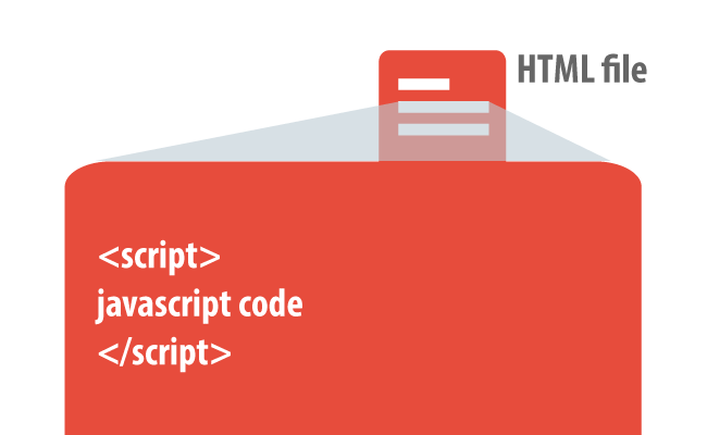
Inline JavaScript entails embedding your JS code directly within your HTML document, eliminating the need for separate external JS files. This approach reduces the number of requests a browser must make before rendering your webpage, potentially speeding up load times. What is Inline JavaScript? Inline JavaScript refers to the practice of directly embedding JavaScript code […]

Conditional JavaScript: Loading of Resources for Mobile Views
Optimizing your site for both desktop and mobile users without sacrificing content or functionality is paramount. Conditional JavaScript emerges as a potent solution, allowing developers to tailor the loading of resources based on device specifications, ultimately enhancing page load times and user experience. What is a Conditional in JavaScript? A conditional in JavaScript is a […]

What Plugins You Should Avoid to Increase SEO Performance?
Plugins are external software components required to render specific types of content on web pages. As compiled third-party applications, they interact with browsers at a low level to enrich web content. Notably, plugins like Adobe Flash have historically played a key role in delivering multimedia content, though their efficacy across mobile platforms is limited. What […]

Keep Alive: How to Enable It to Improve Website Performance?
Understanding and implementing the Keep-Alive feature in web development is not just advantageous—it’s essential. As we delve into the world of persistent connections, the subtle yet profound impact of this feature on enhancing user experience and optimizing server performance becomes evident. Introduction to Keep-Alive Keep-Alive establishes a persistent connection between a web browser and server, […]

Viewport Sizes: All You Need to Know
Navigating the web on mobile devices can be frustrating when content overflows beyond the viewport’s boundaries. This guide explores the critical role of managing viewport sizes to ensure web content not only fits but also adapts seamlessly across various devices. The viewport, defined as the visible area of a web page on a device’s screen, […]

How to Make a Website Mobile Friendly? – Complete Guide
Ensuring your website caters to this mobile audience is paramount. This guide delves into what it means to be truly mobile-friendly, exploring the criteria, methods, and strategies to optimize websites for the best possible performance and user experience on mobile devices. From the foundational principles laid out by Google to the practical steps for implementation, […]

